Since the release of Tahoe, I’ve been fascinated by the idea of Liquid Glass. Apple describes it as something that “would never exist in real life”, and that is exactly what makes it so interesting to me. In many of the applications I design, I consciously use glass-like transparency as a core visual element. Transparent materials have also become an irreplaceable part of my own design language, Chronoshift. I’ll come back to that later.
In this article, I’ll walk through what I learned from Apple’s official demo project, Landmarks. You can download it from Apple’s documentation.
This article focuses on the macOS version of Landmarks. I’ll leave the iOS and iPadOS versions for future articles.
Landmarks Overview
What makes Landmarks worth studying is that it is not merely a “sample app”. Apple uses it to demonstrate a fairly complete way of thinking about SwiftUI app structure: data is centralized in a shared model, navigation is declared by value instead of being hard-wired into individual views, and large screens are treated as first-class citizens rather than as stretched phone layouts.
In other words, Landmarks is interesting not because it is huge, but because it is small while still carrying many real product ideas.
Landmarks Project’s structure could be demonstrated as below:
Landmarks
├─ App Entry
│  └─ LandmarksApp.swift
├─ Model
│  ├─ Activity.swift
│  ├─ Badge.swift
│  ├─ BadgeProgress.swift
│  ├─ Constants.swift
│  ├─ Elevation.swift
│  ├─ Landmark.swift
│  ├─ LandmarkCollection.swift
│  ├─ LandmarkCollectionData.swift
│  ├─ LandmarkData.swift
│  ├─ LocationFinder.swift
│  └─ ModelData.swift
└─ Views
   ├─ Badges
   │  └─ BadgesView.swift
   ├─ Collections
   │  ├─ Collection Detail
   │  │  ├─ CollectionDetailDisplayView.swift
   │  │  ├─ CollectionDetailEditingView.swift
   │  │  └─ CollectionDetailView.swift
   │  └─ Collections
   │     ├─ CollectionListItemView.swift
   │     ├─ CollectionsGrid.swift
   │     └─ CollectionsView.swift
   ├─ Landmarks
   │  ├─ FlexibleHeader.swift
   │  ├─ Landmark Detail
   │  │  ├─ LandmarkCollectionsMenu.swift
   │  │  ├─ LandmarkDetailInspectorView.swift
   │  │  ├─ LandmarkDetailMapView.swift
   │  │  ├─ LandmarkDetailView.swift
   │  │  └─ LandmarkFavoriteButton.swift
   │  ├─ Landmark Grid
   │  │  ├─ LandmarkGridItemView.swift
   │  │  └─ LandmarksGrid.swift
   │  ├─ Landmark Selection
   │  │  ├─ LandmarksSelectionList.swift
   │  │  └─ LandmarksSelectionListItem.swift
   │  └─ Landmarks View
   │     ├─ LandmarkFeaturedItemView.swift
   │     ├─ LandmarkHorizontalListView.swift
   │     ├─ LandmarkListItemView.swift
   │     ├─ LandmarksView.swift
   │     └─ ReadabilityRoundedRectangle.swift
   ├─ Landmarks Split View
   │  ├─ LandmarksSplitView.swift
   │  └─ NavigationOptions.swift
   └─ Map
      └─ MapView.swift
At first glance, the folder tree may look large for a demo project. But after reading through it, I found that its structure is actually very disciplined. The project is split into three clear layers:
- App entry, where the app is launched and environment state is injected.
- Model, where data, constants, grouping logic, and location-related utilities live.
- Views, where the UI is further decomposed into navigation, page-level containers, and small reusable components.
This separation is worth paying attention to. Landmarks does not try to make each file “smart”. Instead, it gives each file a narrow responsibility. That is one of the reasons why the project remains readable even though it contains many screens and components.
Before diving into individual files, it is useful to look at Landmarks as a complete experience. The macOS version does not feel like a phone UI transplanted onto a larger screen. Instead, it takes advantage of desktop navigation patterns such as split view, sidebar-based routing, inspector presentation, and spacious content layouts. That makes it especially useful for anyone who wants to study SwiftUI beyond iPhone-sized design.
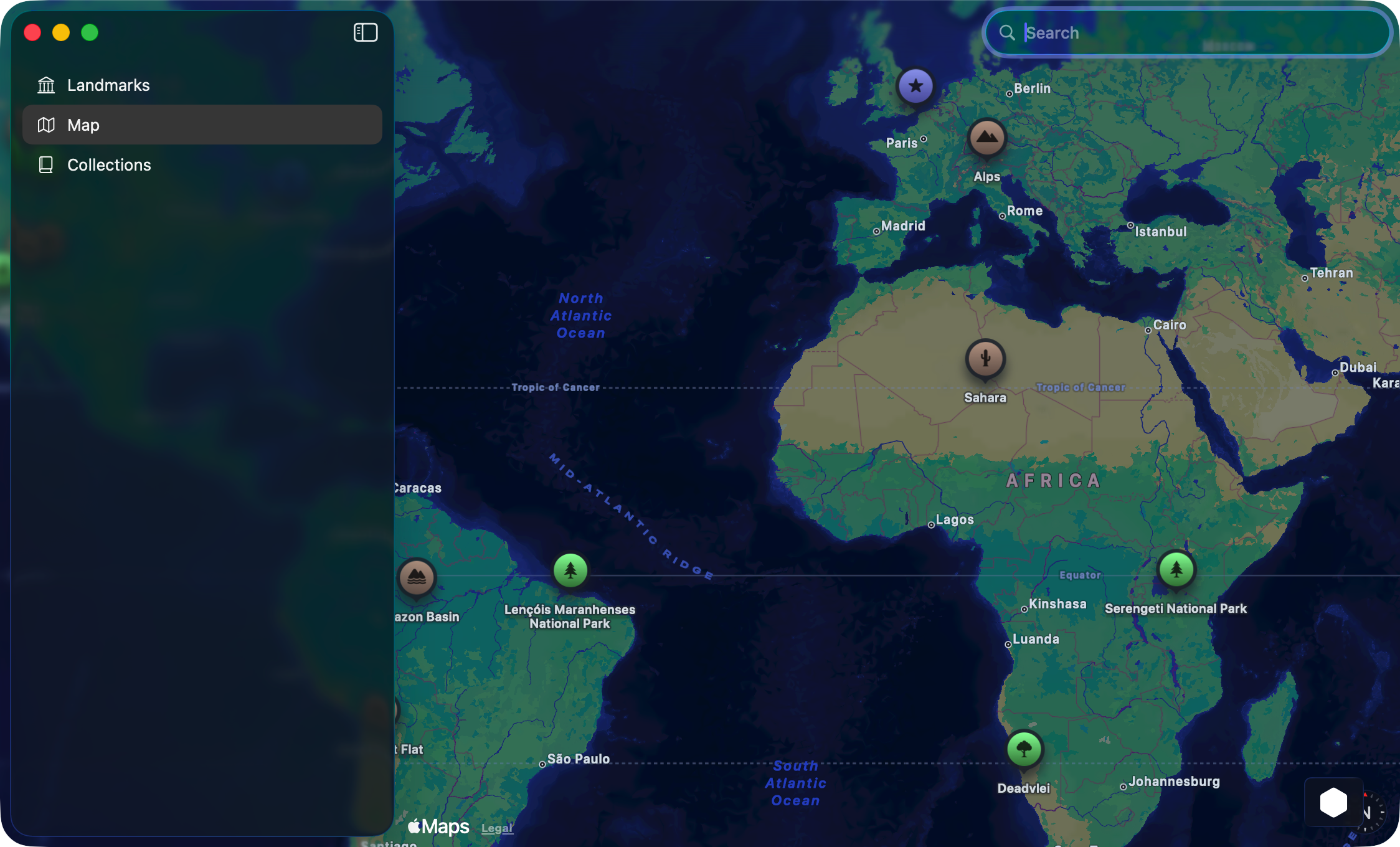
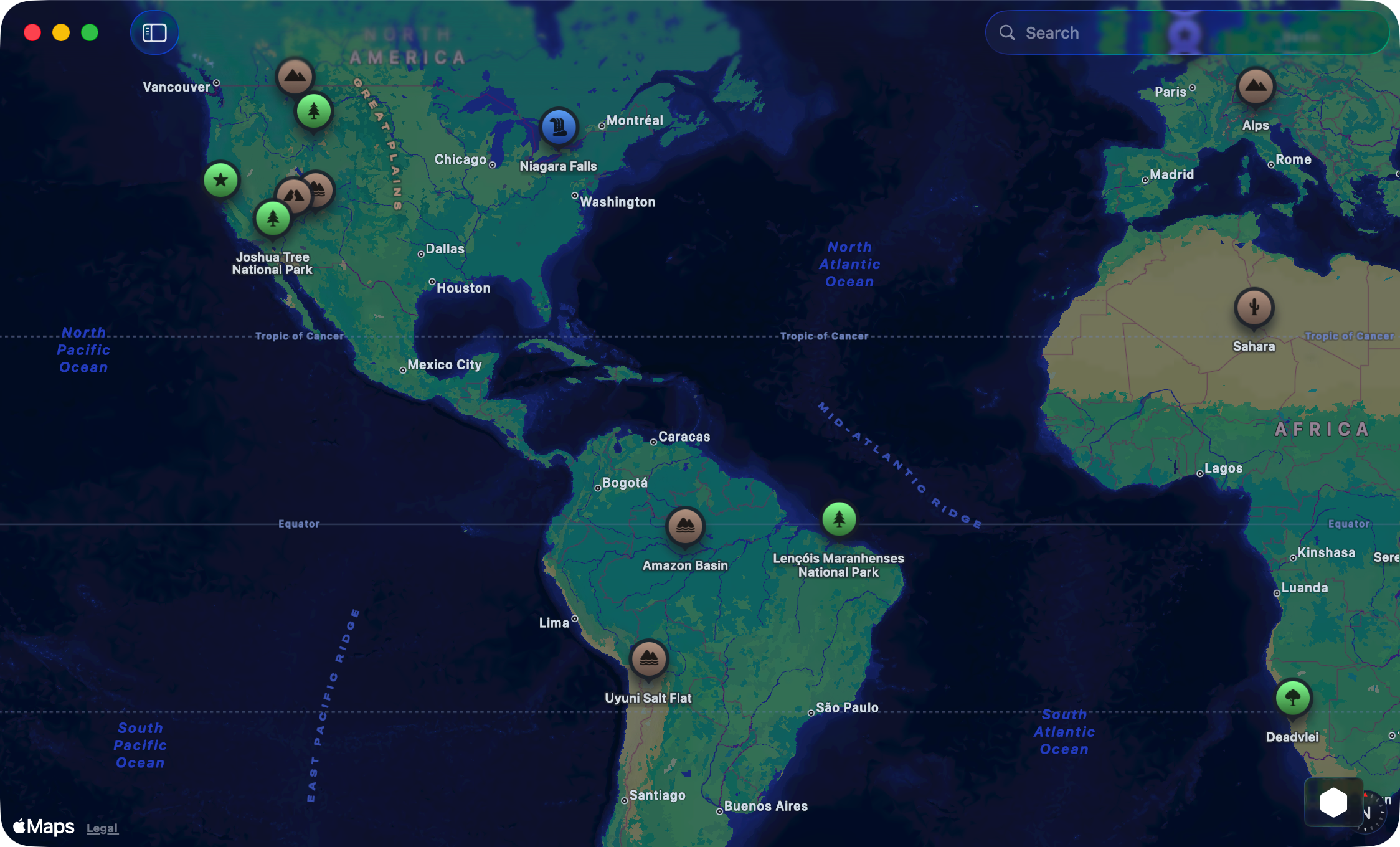
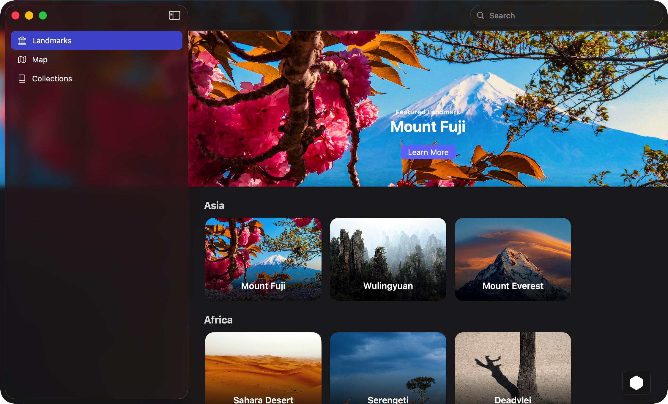
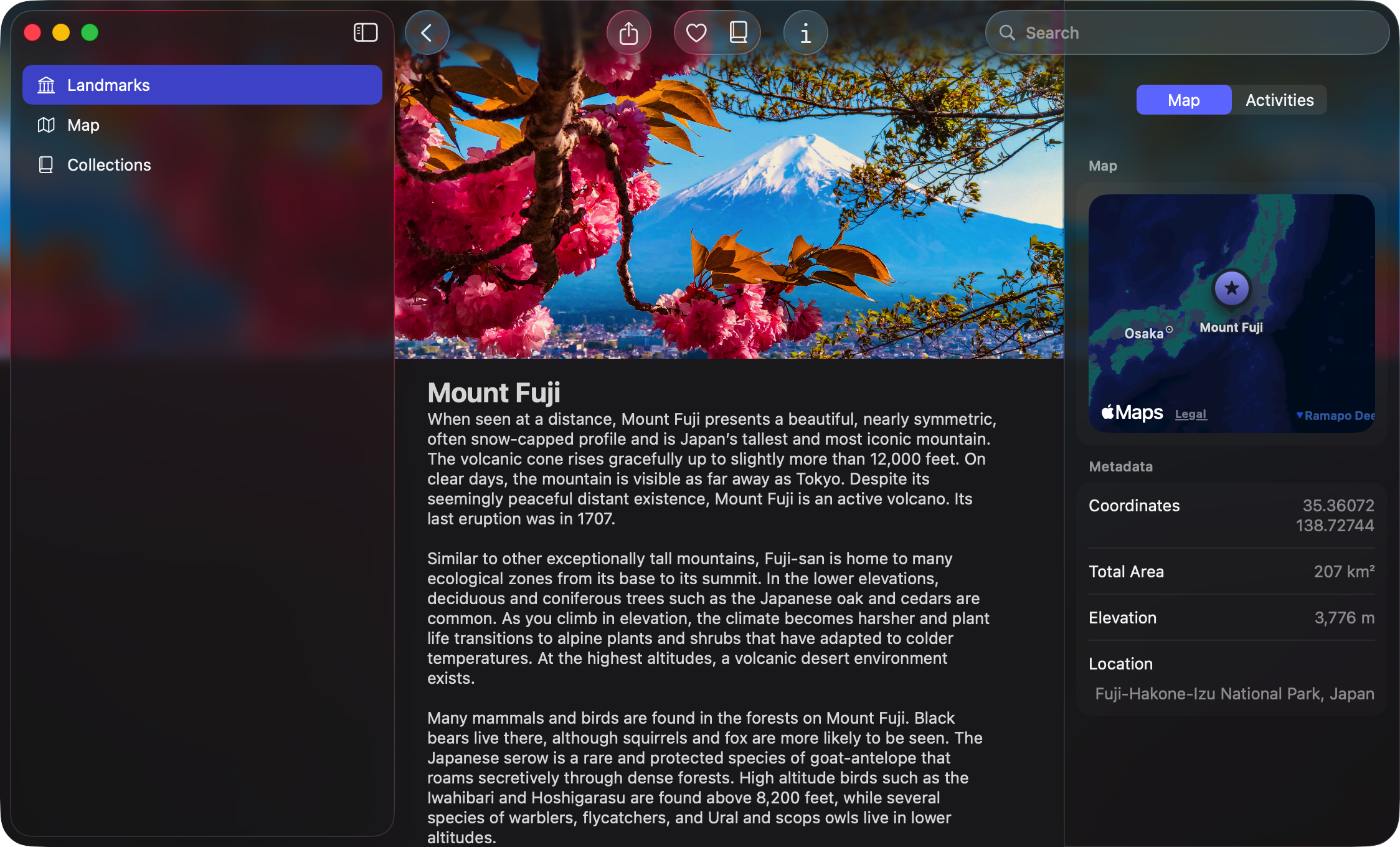
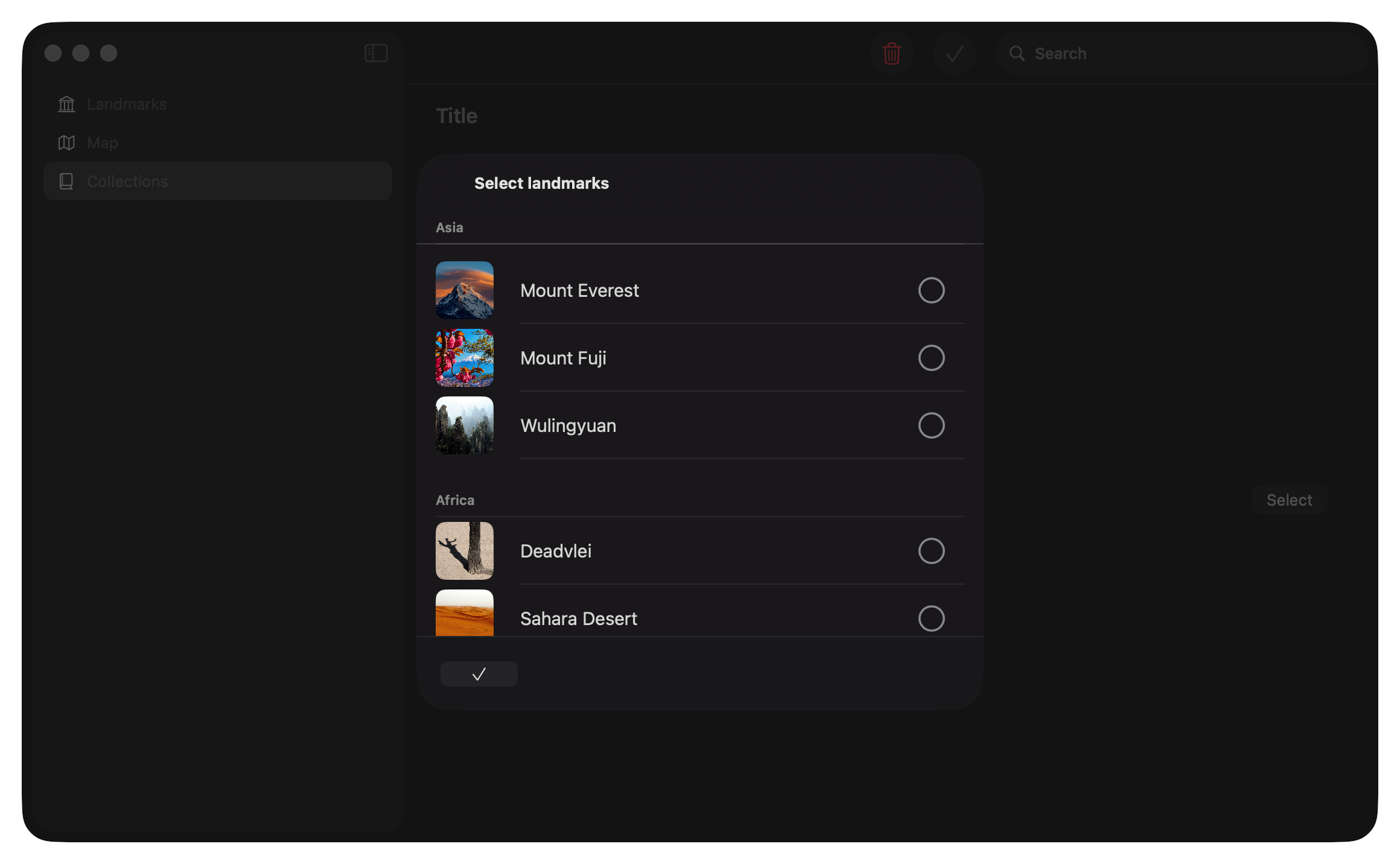
Here are some beautiful interface screenshots about Landmarks.
How to Learn from this Demo?
When I first opened the project, what caught my attention was naturally the visual side: the translucent surfaces, the layered presentation, the feeling of depth, and the use of motion to make a static interface feel alive. But after going deeper, I realized that the most valuable part of Landmarks is not the styling itself. It is the way visual polish is supported by structure.
A lot of SwiftUI examples online focus on isolated techniques such as a blur effect, a fancy card, or a custom transition. Landmarks is different. It shows how those techniques can live inside a coherent application architecture. The result is an interface that feels elegant not only because it looks good, but because the code underneath it is organized in a way that lets the design remain scalable.
For me, this is also where Landmarks becomes relevant beyond Apple’s own design language. If you are building your own visual system, the lesson is not simply “use Liquid Glass”. The lesson is that advanced visual materials only work well when hierarchy, spacing, navigation, and data flow are already under control. Glass, translucency, and depth are amplifiers. They do not replace structure; they reveal whether structure is already there.
In the sections below, I will focus on a few parts that I think are especially worth learning from:
- how Landmarks organizes navigation with
NavigationSplitViewand typed destinations - how the main browsing page is built from small composable views
- how Apple handles readability and hierarchy on top of image-heavy cards
- how visual effects such as flexible headers support the content instead of distracting from it
- and finally, what parts of this project I think are genuinely transferable into real-world SwiftUI apps
LandmarksView: How Apple Builds a Browsing Homepage
One of the most instructive parts of Landmarks is LandmarksView. This file is a good example of how Apple builds a homepage-like browsing experience in SwiftUI without making the code hard to read.
Here is the full source again for reference:
struct LandmarksView: View {
    @Environment(ModelData.self) private var modelData
    @Environment(\.isSearching) private var isSearching

    var body: some View {
        @Bindable var modelData = modelData

        ScrollView(showsIndicators: false) {
            LazyVStack(alignment: .leading, spacing: Constants.standardPadding) {

                LandmarkFeaturedItemView(landmark: modelData.featuredLandmark!)
                    .flexibleHeaderContent()

                ForEach(ModelData.orderedContinents, id: \.self) { continent in
                    Group {
                        ContinentTitleView(title: continent.name)
                        if let landmarkList = modelData.landmarksByContinent[continent] {
                            LandmarkHorizontalListView(landmarkList: landmarkList)
                                .containerRelativeFrame(.vertical) { height, axis in
                                    let proposedHeight = height * Constants.landmarkListPercentOfHeight
                                    if proposedHeight > Constants.landmarkListMinimumHeight {
                                        return proposedHeight
                                    }
                                    return Constants.landmarkListMinimumHeight
                                }
                        }
                    }
                }
            }
        }
        .flexibleHeaderScrollView()
        .ignoresSafeArea(.keyboard)
        .ignoresSafeArea(edges: .top)
        .toolbar(removing: .title)
        .navigationDestination(for: Landmark.self) { landmark in
            LandmarkDetailView(landmark: landmark)
        }
    }
}
At a high level, this view implements a homepage with three layers: 1. a featured landmark at the top 2. a sequence of continent sections 3. a horizontal scrolling row of cards inside each section
That means the page is not a plain list. It is closer to a content browser, where the user first sees a highlighted item and then explores the rest by category.
- Data comes from environment, not from local view state
The first line worth noticing is this one:
@Environment(ModelData.self) private var modelData
Instead of owning its own data, LandmarksView reads from a shared ModelData object injected into the environment. This is important because the page itself does not try to become the source of truth. It only renders what the app model already knows.
From the rest of the file, we can infer that ModelData provides at least these pieces of information: • featuredLandmark • landmarksByContinent • orderedContinents
That design keeps the view layer focused on presentation. The grouping logic already exists in the model layer, so the view does not need to sort, classify, or transform raw data on every render.
There is also this line:
@Environment(\.isSearching) private var isSearching
Interestingly, isSearching is not used anywhere in the file. In practice this usually means one of two things: either Apple planned to adapt the UI when search becomes active, or the property remained after a refactor. In its current state, it does nothing.
- @Bindable makes the environment model bindable inside the view body Inside body, Apple writes:
@Bindable var modelData = modelData
This is one of the newer observation-related patterns in SwiftUI. It creates a bindable local projection from the environment model, which allows the view to pass bindings like $modelData.someProperty into child views when necessary.
In this specific file, that bindable projection is not heavily used. Even so, it signals something important about the architecture: ModelData is not just passive read-only data. It is a shared observable model that other parts of the app can mutate through bindings.
- The page is a vertical scroll view with lazy loading The main layout starts here:
ScrollView(showsIndicators: false) {
    LazyVStack(alignment: .leading, spacing: Constants.standardPadding) {
        ...
    }
}
This is a very common but very effective combination. • ScrollView provides vertical scrolling for the whole page • LazyVStack arranges the sections vertically • showsIndicators: false removes the default scroll bar styling for a cleaner visual presentation
The important choice here is LazyVStack rather than VStack. A regular VStack eagerly creates all of its child views. A LazyVStack creates them more on demand as they become relevant to the visible region. For a browsing page with many sections, this is a safer default.
- The top of the page is a featured item, not a text header The first child inside the stack is this:
LandmarkFeaturedItemView(landmark: modelData.featuredLandmark!)
    .flexibleHeaderContent()
This immediately tells us that Landmarks is trying to create a visually rich homepage rather than a utility-style list.
A few details matter here.
First, the page begins with a custom component called LandmarkFeaturedItemView. That means the visual complexity of the hero section is isolated in its own file. The homepage remains readable because it delegates detailed rendering.
Second, the data is force-unwrapped:
modelData.featuredLandmark!
This implies a strong assumption: the model must always be able to provide a featured landmark. If it cannot, this view will crash. So even though the UI code looks simple, it depends on the data layer maintaining that invariant.
Third, the .flexibleHeaderContent() modifier suggests that the featured item is not a normal card. It is probably participating in a flexible header system where the top content stretches, compresses, or scrolls in a custom way.
- Continents are rendered in a fixed order The next major block is this loop:
ForEach(ModelData.orderedContinents, id: \.self) { continent in
    Group {
        ContinentTitleView(title: continent.name)
        if let landmarkList = modelData.landmarksByContinent[continent] {
            LandmarkHorizontalListView(landmarkList: landmarkList)
                .containerRelativeFrame(.vertical) { height, axis in
                    let proposedHeight = height * Constants.landmarkListPercentOfHeight
                    if proposedHeight > Constants.landmarkListMinimumHeight {
                        return proposedHeight
                    }
                    return Constants.landmarkListMinimumHeight
                }
        }
    }
}
This is where the page becomes a structured content browser.
The first design decision is subtle but important: Apple does not iterate directly over the grouped dictionary. Instead, it iterates over ModelData.orderedContinents.
That means ordering is controlled explicitly. Dictionaries are not a good way to express visual order. By separating grouping from ordering, Apple avoids unstable presentation and makes the page feel deliberate.
So the logic is effectively: • take the predefined continent order • render a section title • look up the landmarks for that continent • if landmarks exist, render the row
This is a strong pattern for real projects as well. Visual order should usually come from a dedicated ordered source, not from incidental storage structure.
- Section title and section content are intentionally separated Inside each loop, Apple uses a small helper view:
ContinentTitleView(title: continent.name)
The implementation is very small:
private struct ContinentTitleView: View {
    var title: String

    var body: some View {
        Text(title)
            .font(.title2)
            .bold()
            .padding(.top, Constants.titleTopPadding)
            .padding(.bottom, Constants.titleBottomPadding)
            .padding(.leading, Constants.leadingContentInset)
    }
}
This is a tiny component, but it demonstrates a good habit. Even though the section header is only a styled Text, Apple still pulls it into its own view. That has two benefits: • the main page stays visually simpler • typography and spacing rules are centralized
The code remains scalable because repeated styling does not accumulate directly inside LandmarksView.
- Each continent uses a horizontal list instead of a vertical sublist If data exists for the current continent, Apple renders:
LandmarkHorizontalListView(landmarkList: landmarkList)
This changes the page from a standard outline into a media-style browsing interface. Instead of expanding each category into another vertical list, every continent is presented as a horizontal strip.
That gives the page a layered navigation rhythm: • vertical movement between continents • horizontal movement within a continent
This combination is common in content platforms because it lets many items remain visible without making the whole screen feel like a long table.
- Height is adaptive rather than hard-coded The horizontal row is wrapped with this modifier:
.containerRelativeFrame(.vertical) { height, axis in
    let proposedHeight = height * Constants.landmarkListPercentOfHeight
    if proposedHeight > Constants.landmarkListMinimumHeight {
        return proposedHeight
    }
    return Constants.landmarkListMinimumHeight
}
This part is especially worth studying.
Apple does not assign a fixed height like frame(height: 180). Instead, it computes a row height relative to the available vertical container size.
The logic is: • multiply the available height by a configured percentage • compare that against a minimum allowed height • use whichever is larger
In more compact form, the behavior is basically:
max(containerHeight * percentage, minimumHeight)
That means the row scales with window size, but never shrinks below a usable threshold. This is a very desktop-friendly decision. It helps the same view adapt to different macOS window sizes without becoming either cramped or oversized.
- Safe-area handling is used to support immersive top content The page also includes:
.ignoresSafeArea(.keyboard)
.ignoresSafeArea(edges: .top)
The second modifier is especially relevant. Because the page has a prominent top header, allowing content to extend into the top safe area helps the hero section feel immersive. Without that, the page would start lower and lose part of its visual impact.
The keyboard-related modifier is less central here, since this particular page is not text-input-heavy. It may exist for consistency across the broader app layout.
To be continued…